
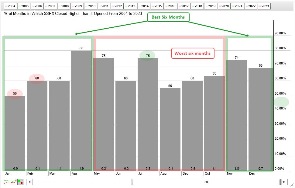
According to the Stock Trader’s Almanac, the best six-month period runs from November to April. The worst six-month period runs from May to October. This is where the phrase “sell in May and go away” comes from. There is some validity to the best six months strategy, but investors would probably be better off with a simple timing tool. We will first investigate the best and worst six months, and then show the timing tool.
The chart below shows historic seasonal performance for the S&P 500 since 2004 (20 years). The red shading shows the worst six months, and the green shading highlights the best six months. There are some pretty good months within the worst six month period (May, July). There are also some so-so months within the best six month period (January, February).
I would like to show a different perspective on this seasonal pattern using an equity curve. The strategy buys the S&P 500 on the first day of November and sells on the first day of May. It is long the S&P 500 during the best six months and in cash the other six months. The chart below shows the equity curve for this strategy (green line) and the equity curve for the S&P 500 (blue line). There is a pretty strong positive correlation with S&P 500 performance as both curves rising and fall together. Avoiding the worst six months did not provide immunity to broad market swings and the Maximum Drawdown was 47.5%. The red shading shows the best six months outperforming in 2001 and 2002 because it missed some big declines in September. Avoiding drawdowns is an important part of our strategies at TrendInvestorPro (here).
Now let’s turn the tables. We will now buy the S&P 500 on the first trading day of May and sell on the first trading day of November. These are the worst six months. Being long during the worst six months did not keep up with buy-and-hold. However, we can see a positive correlation with buy-and-hold (blue line). The green and red arrow lines show the equity curve rising and falling along with the market. The red shading shows the equity curve falling as the market rose in 2010, 2011 and 2012.
Even though the best six months strategy performed admirably, it did not preserve capital as it experienced a 47.55% drawdown in February 2009. Seasonal patterns are interesting and sometimes work, but they are not that great for timing and avoiding drawdowns. The next chart shows the equity curve for a strategy that buys and sells the S&P 500 based on the 5/200 day SMA cross. Buy when the 5-day SMA for the S&P 500 crosses above the 200-day SMA and sell when the 5-day crosses below. The Maximum Drawdown was limited to 20.53% because the 5/200 cross triggered timely sell signals in 2000 and 2007. Also notice that the drawdowns in 2020 and 2022 were shallower.
This 5/200 cross is part of the Composite Breadth Model (CBM), which is used for broad market timing at TrendInvestorPro. The CBM has been bullish since March 31st (2023) and this means stock strategies are active. We are currently running momentum-rotation strategies that trade Nasdaq 100 and S&P 500 stocks on a weekly basis. In testing, these quantified strategies handily outperformed buy-and-hold and did so with much lower drawdowns. Click here to learn more.
—————————————