
Sample Report
Below is our latest Weekly Market Report (WMR), which is published on Sunday/Monday of every trading week. It’s unlike our Daily Market Report (DMR) as the WMR focuses almost exclusively on the Big Picture and is more designed for those with longer-term investing/trading horizons. Our DMR looks much more closely at current action, designed more for active traders.
I thank all of you that have followed my work here at StockCharts.com over the past 16 years and this sample report is just a small Thank You for your support! If you like the report below and would like to subscribe to our full service, we do offer a 30-day FREE trial and signing up now makes a lot of sense. Our Fall Special, which offers the absolute best price for our service, begins tomorrow and will last roughly through the end of November. If you take us up on our Trial Offer and enjoy our service, you can then subscribe using our BEST DEAL of the year.
Either way, ENJOY and Happy Thanksgiving!
Weekly Market Recap
Major Indices
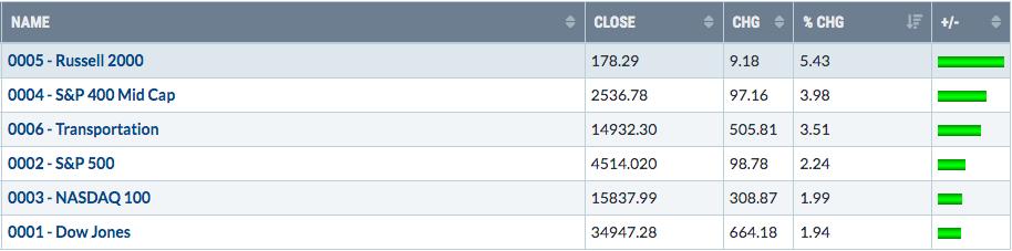
We finally saw some relative strength out of small caps (IWM) and mid caps (MDY) last week. All of our major indices gained ground, but the IWM nearly tripled the NASDAQ 100 and simply acted much more bullishly after the tame October CPI report was released on Tuesday morning before the opening bell. That triggered a tsunami of buying on Tuesday. After a brief pullback, the small cap bulls were back out on Friday. I would treat the IWM as an uptrending ETF – until proven otherwise. Check out the chart, with two key support levels identified:
There’s still much work to do, but the IWM is at least beginning to show significant improvement, especially on the absolute price chart. The huge gap up on Tuesday now provides us excellent gap support at 174.23 and the rising 20-day EMA is currently at 172.17. Those are the two support levels to watch closely.
Sectors
Two sectors that had really struggled in 2023 due to higher interest rates were real estate (XLRE) and utilities (XLU). It made sense for these two to perform well when investors poured into bonds last week, sending the 10-year treasury yield ($TNX) plummeting. Consumer discretionary (XLY) had an excellent week as well. You’ll see below that 4 of the top 6 industry groups last week were in the consumer discretionary sector.
I generally define a daily uptrend as “price above the 20-day EMA and the 20-day EMA above the 50-day SMA”. Of our 11 sectors, XLB is on the verge of meeting this definition as it prepares for a golden cross (20-day EMA crossing above 50-day SMA). The only other two sectors not meeting this definition and still showing more work left on their charts are energy (XLE) and health care (XLV). Here are the two charts:
XLE:
The XLE printed a tail beneath recent price support on Thursday, then recovered to test its nemesis, the 20-day EMA. Currently, the XLE is caught between those two – price support near 82.50 and the 20-day EMA at 85.26. Let’s see which one breaks first. In a bull market, I give the edge to the XLE breaking back above the 20-day EMA.
XLV:
The XLV seems to be a bit further along in its recovery attempt. It currently resides right at key price and trendline resistance. A breakout would be a solid piece of technical evidence that the “correction bottom” is in for the XLV.
Top 10 Industries Last Week
Renewable energy ($DWCREE) jumped about 13% on Tuesday alone after the October CPI report was released. The 290-300 area has proven to be difficult short-term resistance, so let’s see if the group can power through that area this week:
In that resistance zone is gap resistance and multiple price attempts at a breakout, so clearing it would definitely improve the technical picture here, perhaps even switching the overall trend from downtrend to uptrend. Before you get too excited, however, please keep in mind that renewables have been lagging badly vs. the benchmark S&P 500. We’ve seen some improvement, but there’s little leadership. In other words, much of the current rebound can be attributed to very oversold conditions and a bounce, plus a very strong overall market. It’s the old Wall Street adage, “a rising tide lifts all boats”. In that bottom panel, breaking the relative downtrend is truly what this group needs.
Bottom 10 Industries Last Week
I find about half of the above industry groups to be bullish on their charts. Apparel retail ($DJUSRA) has been very strong since its early-June low and the recent selling appears to be a handle off of a cup:
The huge spike in volume likely was the result of Gap’s (GPS) massive volume, which accompanied a much-stronger-than-expected quarterly earnings report. The DJUSIB, DJUSRD, DJUSMF, and DJUSHN all were among the 10 biggest losers last week, but still show technical promise, in my opinion. The DJUSIB, in particular, looks solid, having broken to a 52-week high earlier this month and still trading well above its rising 20-day EMA.
Top 10 Stocks – S&P 500/NASDAQ 100
Bottom 10 Stocks – S&P 500/NASDAQ 100
Big Picture
We cleared yet another hurdle on the S&P 500 as we cleared the 4500 level. After reaching a high of just over 4600 in July and pulling back to 4103.78 on October 27th, the bulls are back in charge. The S&P 500 is now nearing its 2023 high, just 2% away. The recent recovery is just one more reason why I like to take a step back and view the “Big Picture”, much more easily recognizing the current secular bull market:
The bottom panel highlights the 240-month (20 year) rate of change (ROC). I like to look at this for perspective. While many bearish analysts believe we’ve run too far to the upside and have lots of downside ahead, this 240-month ROC tells me a completely different story. This ROC has come nowhere close to the highs we saw in the previous two secular bull markets. If anything, this suggests we could have much more upside ahead than any of us can imagine right now. It’s one reason why I believe the S&P 500 could triple over the next 8-10 years, before we hit the next secular bear market.
Sentiment
I look at two key sentiment readings – the Volatility Index ($VIX) and the equity-only put-call ratio ($CPCE). Others use surveys, but I don’t trust those. After all, wouldn’t you rather see what traders are doing with their money rather than their lips? Yeah, me too.
Volatility Index ($VIX)
The first thing to understand is that the VIX is a calculation of “expected volatility” ahead. The calculation is based on the pricing of short-term S&P options. I like to view this as my “market maker sentiment reading”. Market makers set the premiums that they require option holders to pay. If market makers are looking to protect themselves against volatile market action, they’ll put higher premiums on options. If we’re in a boring market environment (nearly always occurs in bullish market environments), premiums are much lower and indicative of little volatility ahead. Market makers are giving us a GREAT BIG CLUE as to where they see the market heading.
Typically, a VIX over 20 suggests a fairly high expectation of trouble ahead as when the VIX rises above 20, you really want to avoid taking any unnecessary risks on the long side. Instead, you want to hunker down. The higher the VIX level goes, the more volatile and scary the action can get. VIX readings above 30 usually require market capitulation before we get a more tradable market on the long side.
If the VIX is in the 17-20 range, I’m usually on high alert. If it’s falling in this range, it can a very bullish signal. If it’s rising in this range, however, and approaching 20, caution would be suggested as selling could escalate quickly. At this point, if I was long and wanted to stay long, I might consider a covered call strategy, if you’re familiar with options. You’ll get a nice premium and it’s a way to at least hedge a little against your long positions.
The most bullish environment is when the VIX is below 17 and declining. We’ve seen that recently. Here’s where the VIX currently stands:
Check out that first big spike in the VIX back in March. That should be ingrained in your mind. That’s what can happen when the VIX moves through 20 resistance and accelerates. The stock market took a tumble of roughly 250 points in one week. The October scare saw the VIX jump 50% in a couple weeks, clearing 20 and reaching a high just above 23. That coincided with another significant selloff as the S&P 500 again lost about 250 points.
Look at those thick red/blue directional lines in November, though. As the VIX came tumbling down, we had a massive market rally as fear began to dwindle. All of this occurred during what we already knew was THE most bullish period historically of the entire year. This is how we can put puzzle pieces together in the short-term to increase our probability of making great market calls.
Equity-Only Put-Call Ratio ($CPCE)
While the VIX is a market-maker-related sentiment signal, the CPCE tells us what the retail trader is doing with their money. Just keep in mind that when retail option traders all start to pile in on the same side of the trade, it usually ends in very ugly fashion for them. We’re looking for the “rubber band to stretch” significantly in either bullish or bearish fashion and we position ourselves on the opposite side, waiting for the “snap back”. In my experience, any time the 5-day SMA of the CPCE hits .75, extreme fear is building and we should begin looking for a market bottom. Sometimes this 5-day SMA reading can reach as high as .85-.90 before a bottom is reached, so this isn’t an exact science. The main point I’m making is that, if you’re shorting or trading equity puts, you need to understand that your profits could swiftly disintegrate once the 5-day SMA of the CPCE moves past .75.
Here’s a historical chart of the CPCE (5-day SMA) to illustrate how this works:
The low 5-day SMA readings below .54-.56 have been solid signals in marking short-term tops, while high 5-day readings above .75 have been excellent in providing us clues of market bottoms. The last reading was circled in red, because it occurred while the market was accelerating to the upside. This tells me that we still have PLENTY of doubters as we rally. I believe that’s a very bullish signal.
Inflation
On Tuesday morning, the October CPI report was released, followed by the October PPI report on Wednesday morning. Both reports continue to stress that inflation is FALLING and it has been consistently for over a year. The stock market LOVES this news and is now rising to be priced accordingly. Do you believe inflation remains a big problem? Keep in mind that the Fed is most interested in Core CPI, so below you’ll find a chart of the absolute monthly Core CPI numbers with two panels below. The first shows the annual Core CPI (12-month rate of change) and the second panel shows the 1-month rate of change (ROC) of Core CPI:
The annual rate is dropping every single month and is now back to 4%. We’re not at the Fed’s target rate of 2%, but the last four monthly CPI increases have been in the “normal range” for the past 30-40 years, between 0.5% and 0.3%. If inflation remains in this area, we’ll be approaching the Fed’s target inflation level by June 2023, which is when many analysts believe the Fed will start lowering interest rates to spark a slowing economy. It’s interesting how this inflation data lines up almost perfectly with that narrative.
Intermarket Analysis
In addition to following technical price action on our major indices, just like most technical analysts, I believe it’s extremely important to monitor key intermarket relationships as well. The two primary relationships for me are (1) XLY:XLP to watch the rotation between the more aggressive discretionary sector (XLY) and the more defensive staples sector (XLP), and (2) QQQ:SPY to observe the rotation between the more growth-oriented NASDAQ 100 and the more value-oriented S&P 500. The former is extremely important, because our GDP is comprised roughly of two-thirds consumer spending. Watching to see where these consumer dollars are going helps us determine whether investors are in a “risk on” or “risk off” mode. The former is bullish, while the latter is bearish.
So where do these two relationships stand today?
XLY:XLP
My analysis features this relationship “ignoring gaps” and “including gaps”. I believe the stock market is highly manipulated, especially at the opening bell. A gap down is a great way to “encourage” unsuspecting traders to sell and a gap up is a great way to “encourage” those same unsuspecting traders to buy. The top panel ignores that opening bell activity and focuses ONLY on the rotation during the trading day. You can’t plot this on a chart with regular data. In order get this intraday rotation, you must keep a User-Defined Index at StockCharts, which is exactly what I do. What we saw during much of the correction was a weak S&P 500, but a strengthening XLY:XLP. It was a rather important signal that the S&P 500 selling would not last. Now we see the result as our major indices scream higher once again.
QQQ:SPY
While the S&P 500 has yet to break above its July high near 4600, this ratio has broken out whether we include or ignore gaps. Again, it’s a bullish signal as the big Wall Street firms buy into the more aggressive growth index, while simultaneously appearing on CNBC to spread indecision, fear, and sometimes, outright doom and gloom. Follow the charts, not the lips on CNBC.
Trade Setup
I discuss potential trade setups here from a LONG-TERM perspective. These are not trades where you’re hoping to jump in, make 10-15%, then sell and move on to something else. Instead, I focus here on stocks that generally have solid long-term track records. Entering at the current level might make sense due to various factors.
Today, I want to highlight Seagate Technology Holdings (STX) as it has performed better than the S&P 500 over time and it also has performed much better than one of its primary competitors, Western Digital Corp (WDC). I also like the recent technical breakout on STX after languishing mostly during the 2022 cyclical bear market and the recent market correction from July to October:
Another positive with STX is that it pays a healthy $2.80 dividend ($.70 per quarter), which results in a 3.69% dividend yield, not a bad addition to the solid long-term capital appreciation.
Looking Ahead
Upcoming Earnings:
Earnings season is slowing down now and most big companies with calendar quarter ends (March, June, September, and December) have already reported their quarterly results. There are a few, however, that do report in other months and you’ll see below that NVIDIA Corp (NVDA) is one of those. The following earnings reports (market cap in parenthesis) are, in my opinion, at least relatively significant and worth watching. This is NOT a list of ALL companies reporting this week, so please be sure to check for earnings of any companies that you own or add:
Monday: A ($33 billion), KEYS ($24 billion), ZM ($19 billion)Tuesday: NVDA ($1.2 trillion), LOW ($117 million), ADI ($90 billion)Wednesday: DE ($109 billion)Thursday: None – Market Closed for Thanksgiving Day HolidayFriday: None – Market Closes Early at 1pm ET
Key Economic Reports:
Monday: Leading indicatorsTuesday: Existing home sales, FOMC minutesWednesday: Initial jobless claims, durable goods, consumer sentimentThursday: None – Market Closed for Thanksgiving Day HolidayFriday: None – Market Closes Early at 1pm ET
Historical Data
I’m a true stock market historian. I am absolutely PASSIONATE about studying stock market history to provide us more clues about likely stock market direction. While I don’t use history as a primary indicator, I’m always very aware of it as a secondary indicator. I love it when history lines up with all my other signals, providing me much more confidence to make particular trades.
Each week, I’ll provide you the average annualized returns for each calendar day and by index. Here are the historical numbers for this week:
S&P 500
November 20: -32.39%November 21: +55.64%November 22: -1.21%November 23: +49.61%November 24: +127.98%
NASDAQ
November 20: -90.10%November 21: +74.67%November 22: -17.21%November 23: +34.13%November 24: +230.95%
Russell 2000
November 20: -72.94%November 21: +71.46%November 22: -9.82%November 23: +63.10%November 24: +255.15%
The S&P 500 data dates back to 1950, while the NASDAQ and Russell 2000 information date back to 1971 and 1987, respectively.
We are now in the most bullish period of the calendar year. The close on October 27th through the close on January 18th is THE ABSOLUTE BEST TIME OF THE YEAR FOR U.S. EQUITIES – HISTORICALLY SPEAKING. Last week was an “ok” period for equities, but the upcoming week typically sees much more historically-bullish action and this bullishness extends through the first week of December.
Final Thoughts
As we move into the Thanksgiving holiday season, let’s keep a few things in mind:
Historical bullishness should not be ignored. 73 years of data on the S&P 500 tell us that NOW is the best time of the calendar year to be bullish and to be long. Fight this historical bullishness at your own risk.The 10-year treasury yield ($TNX) has lost neckline support in a topping head & shoulders pattern, with its initial measurement pegged near the 4.10% levelKey intermarket relationships point to the sustainability of the current S&P 500 rally; 4600 is the next significant test, with a breakout likely sending us higher to test the all-time high near 4820NVIDIA Corp (NVDA) reports its earnings on Tuesday after the bell; this will be significant not only for NVDA, but also for the entire semiconductor group ($DJUSSC). I expect big numbers from NVDA, but it has run a lot in November, now testing critical price resistance at 500.Small caps (IWM) have shown improvement, but continue to watch the KRE (regional banking ETF) and XBI (widely-diversified biotech ETF) for clues about future relative strength; these are the two industry groups that most heavily influence IWM performance.As I pointed out last week, TG Therapeutics (TGTX) is a strong short squeeze candidate, with over 27% of its float short. The closing breakout level of 11.88 provided was cleared on Friday’s close and we now see the result as TGTX is up more than 5.5% at my last look. Volume is picking up and there’s little overhead price resistance. Shorts could be covering big time later today. Wildly accelerating volume will be the major clue that a significant short squeeze is, in fact, underway. Short squeeze trades are ALWAYS extremely risky, but this one has the potential to fly this week.I want to wish everyone a very happy Thanksgiving holiday weekend. If you’re traveling to be with friends and family, please be safe!
Feedback
If you’d like to share your thoughts on our Weekly Market Report, positive or negative, you can reach us at “support@earningsbeats.com”.
Happy trading!
Tom