
I like just about all types of breadth indicators, but I have learned that each type of breadth data requires its own proper manner of interpretation. The whole point of looking at breadth data is to get a different answer about market behavior than what prices are saying, and hopefully that different answer is a useful one.
For this reason, I do not pay much attention to the difference between New Highs (NH) and New Lows (NL). Each of those items can be interesting on its own, if interpreted in the right way, but putting them together is not very useful.
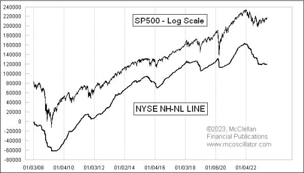
This week’s chart shows a cumulative daily NH-NL Line, which is constructed like a daily Advance-Decline (A-D) Line. We take the number of NH and subtract the NL to get the difference, then add that to the prior day’s value for this NH-NL Line. It is not very useful because, while it matches the price trend, this NH-NL Line lags prices at the turns. Getting a delayed message about a price trend change is not very helpful. It also does not show us useful divergences like the A-D Line does, so we really cannot get any functional information from looking at NH and NL data that way.
One way to combine the NH and NL data that is somewhat useful was developed many years ago by a technical analyst named Mike Moody. It involves these same raw data items, but the magic seems to come from the additional math thrown into it.
Moody’s innovation was to take NH and divide it by the sum of NH+NL, then calculate a 10-day simple moving average of that ratio. Because of the shorter lookback period, it is a much more lively indicator, one which tracks the shorter-term price moves pretty well. And it does sometimes show us useful divergences versus prices. Like any indication of trend, it is subject to noise, whipsaws, and delays, and, when it does display a divergence, one does not know at what moment this apparent divergence might start to matter.
I have found it useful to look at the numbers of NH and NL separately, rather than together. And of these, the numbers of NH tend to give the more useful indications.
The daily number of NH is quite a bit noisier than the 10-day smoothed version that Moody developed, which makes sense. It also shows us more frequent useful divergences, but, once again, there is the problem of not being able to know when an apparent divergence might start to matter. The NL number can get a lot more exciting, but only after a selloff that is severe enough and long enough to produce a rising number of stocks making new 52-week lows.
The problem with this is that, by the time you see a big number for NL, you probably already know from other signs that an ugly price move has been happening. You probably don’t need confirmation from the number of NL in order to know that. But one cool feature is that, in a sharp selloff, the day of the maximum number of NL is almost never the same as the final price low. So, if you see NL making a higher value, you can have some assurance (but not certainty) that the final low is likely not here yet.
I should note a couple of things about these data. The calculations of NH and NL, for years, have employed a 52-week lookback period. It has not always been that way. Before 1980, all of the tabulations of stocks making new 52-week highs or lows were done on paper ledgers, and the record-keepers would have a separate ledger for each stock and for each calendar year. So, on January 2, a new ledger would be started for each stock, tracking its price travels in that calendar year. Because using a new ledger would mean that on the first day of the year, every stock would either be making a new high or a new low for the year, that information would not be useful at all. So the record-keepers would carry over the prior year’s records for a few weeks into the new year, before, sometime around April, they would switch to the new year’s ledgers.
Because of this recording methodology, the NH and NL data which exist before 1980 could employ anywhere from a 4 to 16 month lookback period, making them questionable for their utility. Starting in 1980, the data honchos finally possessed enough computing power to switch over to a more uniform lookback period of a year, and that is the standard that continues in these statistics to this day. It is also worth noting that the tabulation of whether an individual stock has made a new high or a new low is based on intraday trading. So a stock might not have a 52-week closing high, but it could be counted in the NH column of data if it made a new high intraday.
Looking at daily totals of both NH and NL is also sometimes useful, as the late Jim Miekka showed us with his Hindenburg Omen. That signal was a refinement of Gerald Appel’s old “Split Market Sell Signal”, which would be triggered any day that saw both NH and NL for the NYSE exceed 45 on the same day. This was similar to Norman Fosbacks High Low Logic Index, which also looked at big days for both NH and NL. The idea is that seeing both NH and NL get up to high enough values was a sign of illiquidity, and an uptrend coming apart. Miekka adjusted for the changing numbers of issues over time, and added a few additional rules (including use of the McClellan Oscillator) to get better signals.
Coming back to the current day readings, the declining numbers of NYSE NH that are being recorded lately even as the S&P 500 was making higher price highs was a warning of trouble, and is a sign of a loss of broad participation in the rally. That warning does not tell us very much about the potential severity of any decline, but it does tell us that there is a problem.