
Looks Like A Major Shift In Leadership Is Seen In The Energy Sector
The Energy sector seems to be coming back to life.
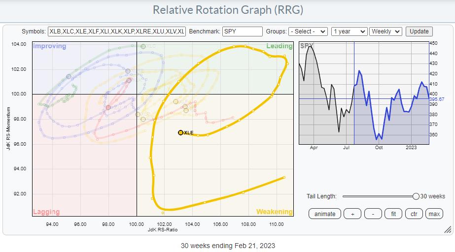
On the Relative Rotation Graph, a long tail is visible that traveled from weakening, starting in July 2022, back up towards and into leading in October 2022. After another rotation through the leading quadrant, the tail for XLE crossed into weakening in January 2023. At the moment, XLE is still inside the weakening quadrant, but the loss of relative momentum (declining JdK RS-Momentum values) has stopped, and over the last two weeks RS-Momentum has carefully started to pick up.
Given the JdK RS-Ratio axis reading, this tail still has room to improve further and curl back towards the leading quadrant without hitting lagging. This will allow investors to embark on an(other) new up-leg within the already rising relative trend.
Looking at the price chart for XLE, we can see that the uptrend that started in 2021 is still in play, with the major rising support line still intact. This trendline already has five touchpoints, making it a reliable and vital trendline. This one to watch!
Since setting a high around 93 in November last year, and testing that peak as resistance again at the end of January puts the chart at risk of a double top formation in the making. The low between these two recent peaks is near 82, while the major trendline is currently coming in around 80 but rising.
This makes the area between 80-82 a very important, double-, support level providing potentially low-risk entry opportunities.
The raw RS-line (second pane) also moves sideways and close to the lower boundary of its range. The move from rising to flat relative strength has caused the RRG lines to level off, as we have seen on the RRG.
When both support levels/areas in price and relative strength can hold up, that will cause the tail to rotate back up further and push XLE into the leading quadrant.
Entry opportunities for XLE will occur in the range between 80-82, with initial stops just below the rising trendline.
Individual Stocks
The RRG of the XLE constituents shows a relatively evenly spread out universe with a slight tilt toward the lagging quadrant. This is because a few heavyweights in the sector, like XOM and MPC, are inside the leading quadrant and rotating at a strong heading. Only one other heavyweight, CVX, is inside the lagging quadrant and at a negative RRG-Heading.
The RRG below highlights the most important tails.
I am especially interested in XOM and MPC moving further into the leading quadrant and CVX, which has returned to lagging from improving.
CVX
CVX has broken below its recent low, potentially completing a double top formation (as described above for XLE). The last resort is now the support offered by the rising trendline. In any case, the recent upward momentum has faded, pulling the relative strength vs. XLE below horizontal support and pushing both RRG lines further down and into the lagging quadrant.
While XLE is holding up well so far, CVX is better avoided.
XOM
XOM is showing a different picture. Price is still trading in a rhythm of higher highs and higher lows and recently pushed to a new high around 119.
The relative strength line vs. XLE also pushed to a new high, making XOM one of the sector’s stronger, if not the strongest, stocks in this sector. With a weight of 24%, this is a significant driver for the sector’s performance as we advance.
MPC
MPC is showing a similar picture as XOM. The uptrend is still fully intact, and price recently set a new all-time high. As they say: “This is not a characteristic of a weak stock.”
The accompanying relative strength line has also pushed to new highs, supporting more strength ahead for MPC.
The RRG lines show an excellent example of a stable relative trend. The JdK RS-Ratio line moves well above the 100-level at a constant level with an initial push higher in JdK RS-Momentum. This was needed to get RS-Ratio above 100. And then RS-Momentum leveled off and remained stable around 100, indicating a steady trend ever since.
Major Shift Underway
XOM vs. CVX is the single one (pair) trade that jumps off the screen for this sector.
The chart above shows the monthly price chart of XOM with RS- and RRG-lines against CVX. The strength and import breaks of overhead resistance XOM are evident.
But the turnaround in relative strength that is becoming more visible might be even more important. From the mid-90s to 2003, XOM dominated the energy sector. From 2003-2009, XOM and CVX moved more or less in sync, and from 2009 to 2021, with a little hiccup in 2014-2016, CVX was the leading stock in the sector.
This relationship seems to be shifting back to XOM again. This process already started in 2021 but is now getting more and more traction.
As this is happening on a monthly time frame, this suggests that a major shift, favoring XOM over CVX, within the sector is underway.
#StayAlert, and have a great weekend, –Julius