
I like to keep my process simple. That means I define the market trend using a simple combination of exponential moving averages. That also means that my charts are relatively straightforward, avoiding too many indicators and sticking to what I consider simple measures of trend and momentum.
So when I think about market breadth, I (not surprisingly) prefer to keep things simple. Are over half of the S&P 500 stocks above their 200-day moving average? Then conditions are pretty good. What if less than 50% of the benchmark names are above their 200-day moving average? Then the picture is probably much less rosy.
We’ll come to the most important breadth indicator in a minute, but first let’s acknowledge the value of simple comparisons of price and moving average.
It All Starts With the 200-Day
One of my early mentors used to say, “Nothing good happens below the 200-day moving average.” While there are indeed some positive things that could happen below the 200-day (bullish divergences come to mind), he was indeed correct that, until the price breaks above this long-term barometer, the conditions are, more likely, less than ideal.
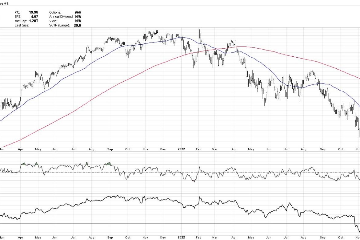
The chart of GOOG over the last two years is a brilliant example of this approach in all its glory.
On the left half of the chart, you’ll notice the price is making higher highs and higher lows. The price is above the 50-day moving average, which is in turn above the 200-day moving average. This chart is “long and strong”, flowing up and to the right.
“A consistent, imperfect routine is way better than an inconsistent, perfect routine.”
What sets successful investors apart from others? A commitment to a consistent set of routines. What is the first chart you look at every day? What do you watch, read, and listen to every day? How would you describe your daily and weekly routines?
In our latest free webinar, I’ll walk through my own Morning Coffee Routine from start to finish. You’ll see what I use to maintain a high situational awareness for the markets, and identify some ways to upgrade your own routines! Sign up HERE for this free event on Tuesday 1/24!
Look how much things evolved on the right half of the chart. The price is now making lower lows and lower highs. The price is below two downward-sloping moving averages. Conditions are clearly bearish.
Now let’s take this analytical approach and expand it into a breadth indicator to tell us more about broad market participation.
The Most Important Breadth Indicator Ever
OK, I’m getting a little aggressive with the superlatives, but this chart has certainly provided some excellent perspective on the last 12 months for stocks. We’re now basically checking 500 charts to see whether the price is above or below the 200-day and 50-day moving averages.
You can see on the first panel below the price that, as of Friday’s close, 62% of the S&P 500 members are above their 200-day moving average. Look at how the indicator was above the pink 50% line for all of 2021, then dipped below the crucial 50% level in the first quarter of 2022. Notice how the indicator moved up to the 50%, but did not get above it, when the S&P 500 tested its own 200-day moving average in August 2022. You can also see how the indicator did finally break above the 50% level in November, as the market moved higher on a broad advance off the October lows.
Then in December, when the S&P 500 pulled back to 3800, this indicator notably remained above the 50% threshold. This was a key bullish tell when I was considering the likelihood of a retest of the October lows. As long as this indicator remains above 50%, then conditions are still fairly constructive for stocks.
Now let’s review the bottom panel, which shows the percent of stocks above the 50-day moving average. On Thursday of this week, the indicator dropped to just below 50%, which is why we highlighted it as a potential breakdown on Thursday’s episode of The Final Bar.
But Friday’s rally on options expiration day pushed this breadth indicator back up to 63%, meaning that most stocks ended the week back above their 50-day moving averages. Investors often use the 50-day moving average as a good pullback indicator, and the fact that stocks are holding the 50-day is a pretty bullish sign going into the weekend.
What Does a Bull Market Recovery Look Like?
I think the chart of Netflix (NFLX) is a good illustration of a rotation from a distribution phase (often described as having more sellers than buyers) to an accumulation phase (buyers outnumber sellers).
See how the price is now above both moving averages, the RSI has remained in the bullish range (above 40), and the relative strength has been trending steadily higher? The more stocks that have this sort of chart, the more likely that our benchmarks are in an uptrend phase.
Friday’s trading session was driven higher by the FAANG stocks and similar names in Technology and Communication Services. If we see more of that sort of behavior going into February, then we may see the sort of bullish environment suggested by the four-year Presidential cycle. For now, I’m focused on this chart of market breadth indicators to see if they remain above the crucial 50% level. As long as that is true, then the bullish recovery phase appears to be intact.
Want to digest this article in video format? Just head over to my YouTube channel.
RR#6,
Dave
P.S. Ready to upgrade your investment process? Check out my YouTube channel!
David Keller, CMT
Chief Market Strategist
StockCharts.com
Disclaimer: This blog is for educational purposes only and should not be construed as financial advice. The ideas and strategies should never be used without first assessing your own personal and financial situation, or without consulting a financial professional.
The author does not have a position in mentioned securities at the time of publication. Any opinions expressed herein are solely those of the author and do not in any way represent the views or opinions of any other person or entity.