
I am convinced that charts give you a window into the collective psychological state of investors. Are people excited or panicky? Euphoric or despondent? Optimistic or pessimistic? All of that is embedded in price action, if you know how to analyze the trends.
As the market rallied strongly off the October lows, fueled by a collapse in the US Dollar and falling interest rates, it felt as if the market could be building enough momentum to rally straight through the new year. If I took anything away from this week, it was that this “uber bullish” scenario is highly unlikely.
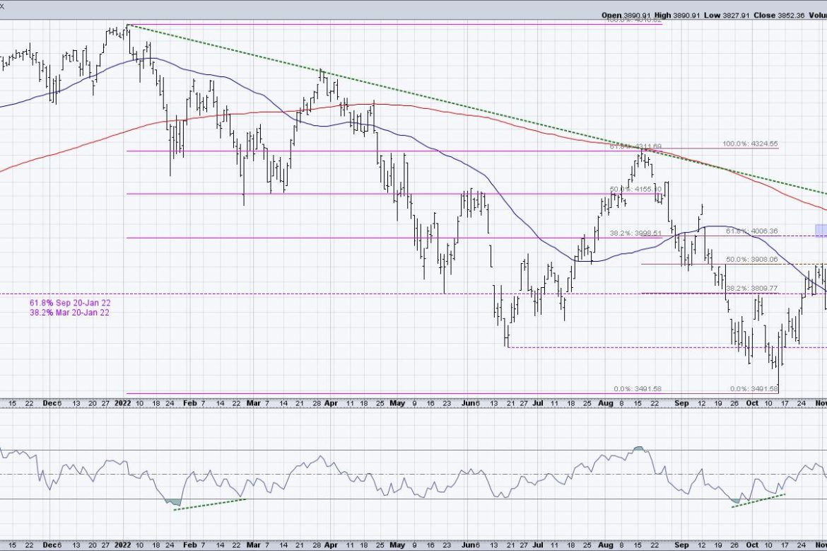
What has changed? Well, to put it simply, the market has stopped going higher.
Your Final Score: Resistance 4 – S&P 500 0
Legendary technical analyst Paul Montgomery, who published a newsletter called “Universal Economics” for over 50 years, once wrote, “The most bullish thing the market can do is go up.”
So when the market failed this week to follow through with a move above its own 200-day moving average, and also failed to break above trendline resistance using the 2022 highs, this suggested to me that the bear market rally from October through December may have exhausted its upside potential.
Here, we see how the S&P 500 first reached a resistance area in the 4000-4050 area in mid-November, then went zero for four in following through on a move above this resistance range. What’s compelling about the timing of this price failure? Seasonally speaking, November and December are two of the strongest months of the year.
Over the last 20 years, November has been up 80% of the time for an average return of 2.1%. December has been positive 70% of the time, with an average return of 1.0%. Now, it’s worth noting that this means, 30% of the time (or six years out of 20), December has actually been a down month.
Seasonal tendencies are just that–tendencies. Not absolutes, not guaranteed moves, but tendencies. Or as I like to think of them (to use flying as a constant analogy for investing), tailwinds vs. headwinds.
Breadth Indicators Echo Caution For Next Week
By analyzing patterns in breadth indicators like the advance-decline lines, we can see how the stocks that comprise the major indexes are performing relative to the index charts themselves. One of my favorite ways to measure breadth is by looking at the percent of stocks above key moving averages. Are individual names above or below their short-term and long-term trend barometers?
As of Friday’s close, 49% of S&P 500 members remain above their 200-day moving average. That’s down from around 65% at the end of November. Similarly, only 59% of S&P 500 stocks are above their 50-day moving average, down from just above 90% at the end of November.
On this chart, I have pink horizontal lines at 50%, as I have found that the market often follows the trend of the bulk of the index. So if most stocks are in an uptrend, defined as being above the moving averages, then the market conditions are overall bullish. Now that more than half of the SPX stocks are below their 200-day moving average, just as the S&P 500 itself is below its own 200-day moving average, it’s hard for me to take that as anything but a bearish signal.
The most bullish thing the market can do is go up. And based on measures we’ve discussed based on price, trend, and breadth, that no longer appears to be the case.
RR#6,
Dave
P.S. Ready to upgrade your investment process? Check out my YouTube channel!
David Keller, CMT
Chief Market Strategist
StockCharts.com
Disclaimer: This blog is for educational purposes only and should not be construed as financial advice. The ideas and strategies should never be used without first assessing your own personal and financial situation, or without consulting a financial professional.
The author does not have a position in mentioned securities at the time of publication. Any opinions expressed herein are solely those of the author, and do not in any way represent the views or opinions of any other person or entity.